Designing the Transparent Donation Experience for Racing Minds ATX Run Club
Building Trust Through Emotional Clarity in Nonprofit UX

Overview
Project Details
- Timeline: January - April 2025
- Role: UX Designer, Researcher, Strategist
- Tools: Figma, Miro, Google Forms, Guerrilla Interviews
- Team Size: 5 (Cross-functional: research, UI, strategy)
Client

Services Rendered
- UX Strategy
- Generative & Evaluative Research
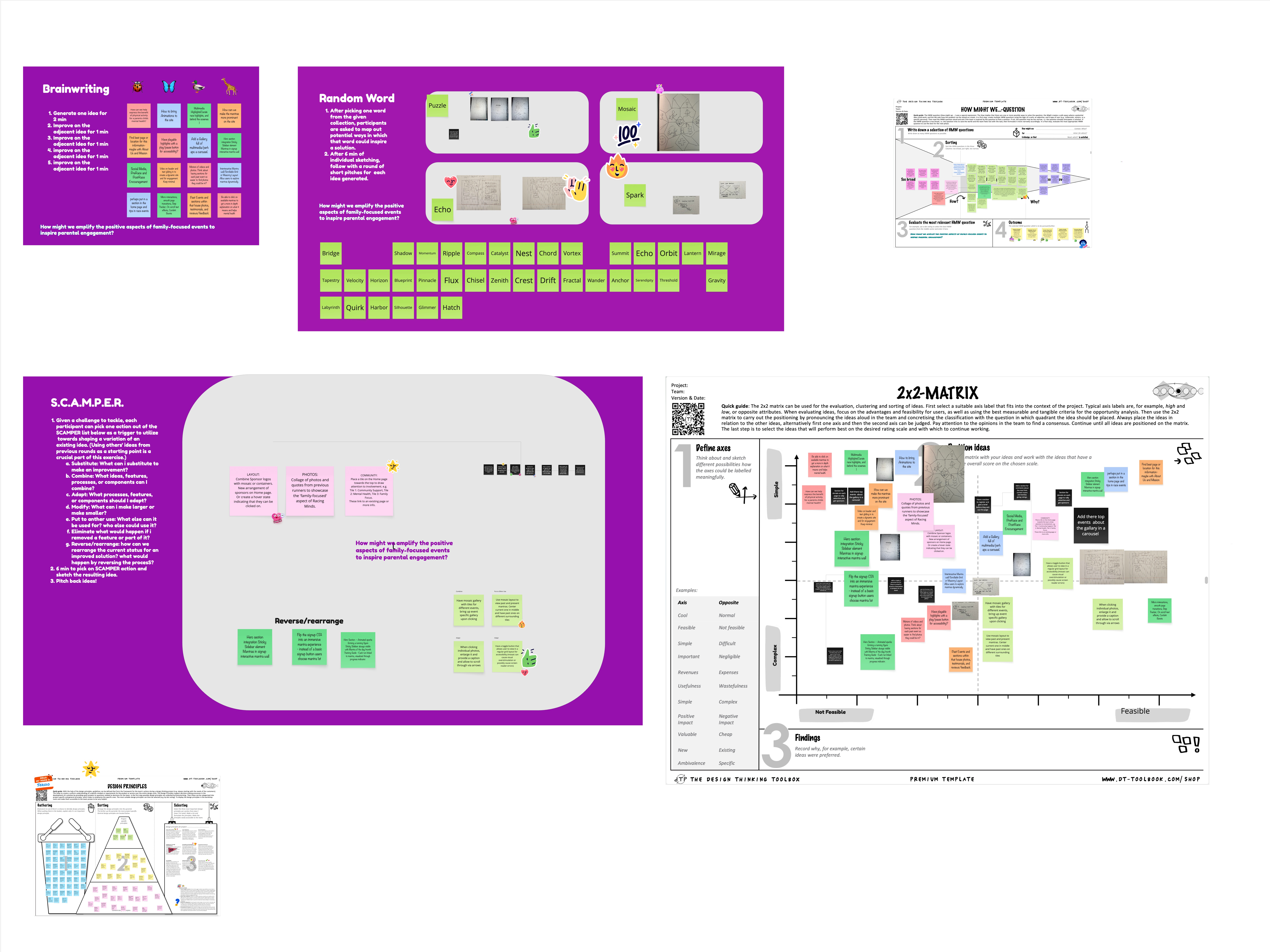
- Ideation Workshops
- Prototyping & Design
- Stakeholder Communication
- User Testing (Impression Testing & Walkthroughs)
Problem Statement
Racing Minds had a powerful mission, but their donation page felt sterile and transactional.
It lacked transparency, feedback, and emotional clarity, critical elements for trust in nonprofit UX.
How might we design a donation experience that not only works, but feels like the mission?
User Persona + Research
Primary Users
- Parents attending events
- Local donors interested in children’s mental health
- First-time online givers
Research Activities
- Guerrilla interviews at community events
- Competitive analysis of GoFundMe, DonorsChoose, and Kickstarter
- Synthesis of pain points and behavioral triggers
Key Insights
- Users give when they feel impact
- Trust grows when users see exactly where their money goes
- Generic CTAs and vague language reduce engagement and confidence

Design Process + Ideation
Methodology
IDEO’s Human-Centered Design
Framing Question
What if donating didn’t feel like checkout, but like participation in a cause?
Concept Developed
The Transparent Donation System
- Clear funding categories like Race Medals, First Aid, Hydration
- Visual feedback with icons and progress bars
- Users choose where their money goes, no guesswork

The Product
A modular donation experience that lets users
- View and fund specific impact areas
- Track category progress (real or simulated)
- Feel emotionally acknowledged for their contribution
All interaction points designed to communicate
“You are part of this mission. And here’s how.”

Testing & Feedback
Methods
- Impression Testing (Preference + Emotional Reaction)
- Walkthrough Feedback
Results
- Users reported higher clarity and emotional impact vs. default form
- Feedback highlights
- “This feels more honest.”
- “I actually want to give now, not just feel like I should.”
- “This feels more honest.”
- Outperformed control page in emotional connection and perceived trust

Reflection and Growth
Design isn’t just what we deliver, it’s how we show up, listen, and move forward together.
This project reminded me that good design isn’t about controlling a user’s path. It’s about inviting belief through clarity, story, and trust.
I learned to advocate for emotional UX, to synthesize user insight into design strategy, and to lead by shaping the experience, even without having control over the whole system.
Link to Mockups